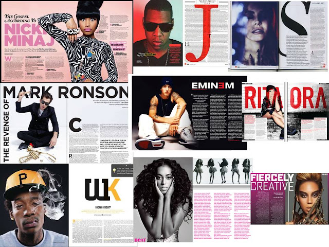
TYPHOGRAPHY MOODBOARD

The fonts on these
mood boards all have the use of similar colours such as black, white or red.
In my opinion, I see that the
‘vibe’ stands out for
me as its black and bold. Its simple and easy to understand. Most of the
mastheads are in caps to show the seriousness of the magazine’s music genre. A
masthead that really stands out with the use of different colours is Billboard.
In my opinion, i think that its probably the best one of all of them.
The use of these colours can show that billboard has a younger target audience
and since it is different to the rock or hip hop masthead it may be targeted to
audiences who prefer to listen to pop or other. Rock or hip hop magazines are
written in bold and have really bright or dark colours to show that their music
is daring and rebellious. Some mastheads have a
coloured background which relates to their music genre. Overall
we can say those music magazine mastheads represents the genre
of the magazine.
Comments
Post a Comment